We have been working with Google Data Studio ( https://datastudio.google.com ) especially since it is now offered fully to the public without limits. It is an amazing tool to give an elegant, customizible display to your Analytics or Adwords data report. Check out our introduction post, What is Google Data Studio?.
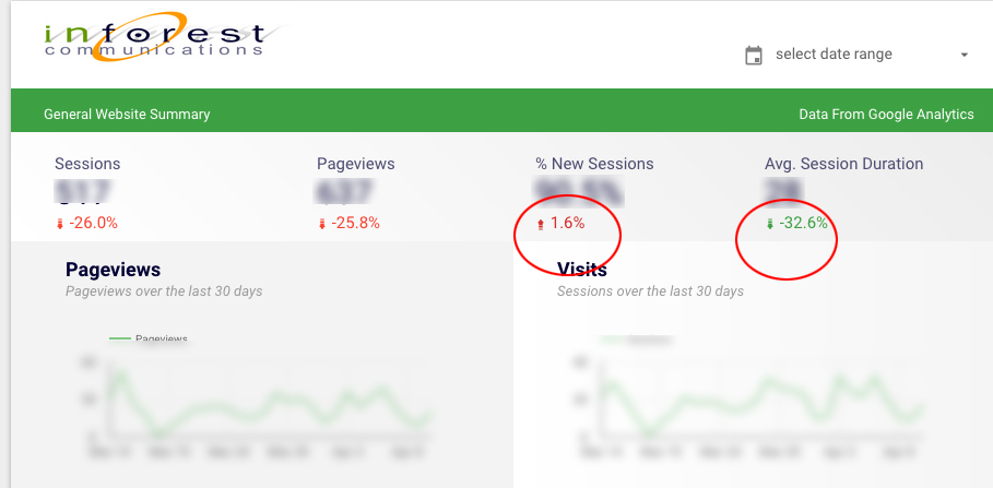
One of our first gotchas was that the Scorecard Comparison Arrows were the wrong color. The red was pointing up the green was pointing down. I was totally dumbfounded. Look at the diagram below to see what I am talking about.

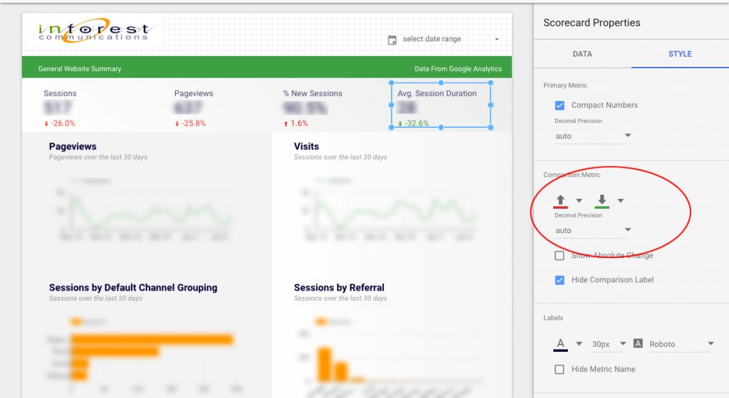
After searching for answers and tinkering with the data studio I figured out that. You can customize the colors and I somehow had the indicating colors switched. To fix it: Select scorecard > style and change the color. See diagram below

Google Data Studio is a great new offering from Google. It makes it easy to create powerful, dynamic data driven reports and dashboards. This allows you, your team and clients to better understand and react to the data that is coming from their websites and apps. However, as with most software, there can be little configuration settings that can be hard to recognize and tweak. Hopefully, this post helps others who come across the same issue in the future.