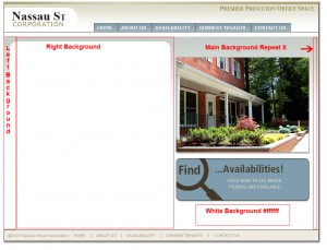
 This week one of the projects is for the “Nassau Street Corporation”. They own the building that our office is in on Witherspoon Street in Princeton. Once the sketch was approved I had to choose how to convert the site efficiently to CSS or Cascading Style Sheets. Fore more info on CSS check out the Wikipedia entry: http://en.wikipedia.org/wiki/Cascading_Style_Sheets. One of my areas of concern was the main body that has the white rounded box (that holds the main content) with a gradient background (from a middle grey to white).
So I took the sketch from Photoshop to Imageready. First I turned off the the text layers so I had just the background as in the example. Next I cut three slices , A narrow slice that encompasses the left corner(Left Background) and the background, A large slice that encompasses a large piece of the white background and the right corner(Right Background), And A slice of Just the background gradation (Main Background). **We do not have to worry about the bottom of the box because it fades to white which is the background color. Last I took the Right Background and cut it into Photoshop and Doubled it’s width (around 900px, size of the main we window) keeping the rounded corner on the right.
The idea is to make it so that this background can adjust to fit any content width within the site. The Left Background is floated to the left and the long Right Background collapses behind it. The Main Background will Repeat to give the gradation to any area outside the box (as in the example).
Here is what the CSS looks like.
.main {
width:900px;
margin: 0px 0px 0px 0px;
padding: 0px;
min-height: 500px;
background: url(images/main_bg.jpg) repeat-x;
}
.inner{
padding: 10px;
}
.column_4{
float: left;
width: 420px;
min-height: 400px;
margin: 0px 0px 0px 0px;
padding: 0px;
background: transparent;
}
.column_5{
float: left;
margin: 0px 0px 0px 0px;
min-height: 300px;
background: transparent url(images/main_round_right.jpg) no-repeat top right;
width: 480px;
}
.column_5_inner{
float: left;
background: transparent url(images/main_round_left.jpg) no-repeat top left;
padding: 10px 10px 10px 30px;
}
Here is what the HTML looks like.
<div>
<div>
<div><h3>Welcome to the CISS 2010</h3>
<p>Lorem ipsum dolor sit amet, consectetur adipiscing elit. Etiam dictum vestibulum odio, et sagittis dolor placerat non. Mauris elementum ullamcorper sollicitudin. Maecenas sem eros, facilisis sed ultricies sed, facilisis eget orci. Duis quis lorem ac risus fringilla bibendum. Nam quis ipsum tortor, ut lacinia augue. Donec scelerisque, elit non congue viverra, turpis nulla elementum sem, id luctus risus felis ac dolor. Etiam at augue elit, sit amet sagittis sapien. Maecenas lectus mauris, euismod luctus rhoncus quis, facilisis in diam. Nullam nunc nunc, commodo eget porttitor scelerisque, congue varius diam. Quisque dapibus ornare pellentesque. Sed sit amet fermentum elit. Etiam a odio vel enim ultrices dapibus. Maecenas eget neque nec metus sodales adipiscing. Integer eu lorem dolor, vitae semper tellus. </p></div></div>
<p> </p>
<div>
<div>
<p><img src=”images/front.png”><br />
<img src=”images/find.png”></p>
</div></div>
<br style=”clear: left;” />