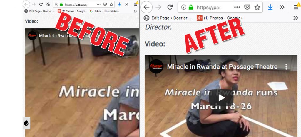
After analyzing our Search Console report, we noticed a frustrating issue — some of our embedded YouTube videos weren’t responsive on mobile devices. They extended beyond the content area, ruining the user experience and tanking our mobile usability scores. That’s when we knew it was time for a Gutenberg Responsive Video Embed Fix to solve the problem and get our site back in shape.

Step 1: Add Responsive Embeds Support to Your Theme
To begin, you’ll want to make sure your WordPress theme supports responsive embeds.
In your sub-theme’s functions.php file, add the following line:
add_theme_support( 'responsive-embeds' );Step 2: Rework Your Video Embeds in Gutenberg
Even with theme support enabled, you’ll likely need to update the way your videos are embedded.
Here’s how to do it:
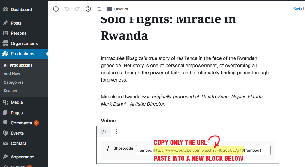
Step 1: Copy the YouTube video URL from your existing embed tag (not the iframe code).
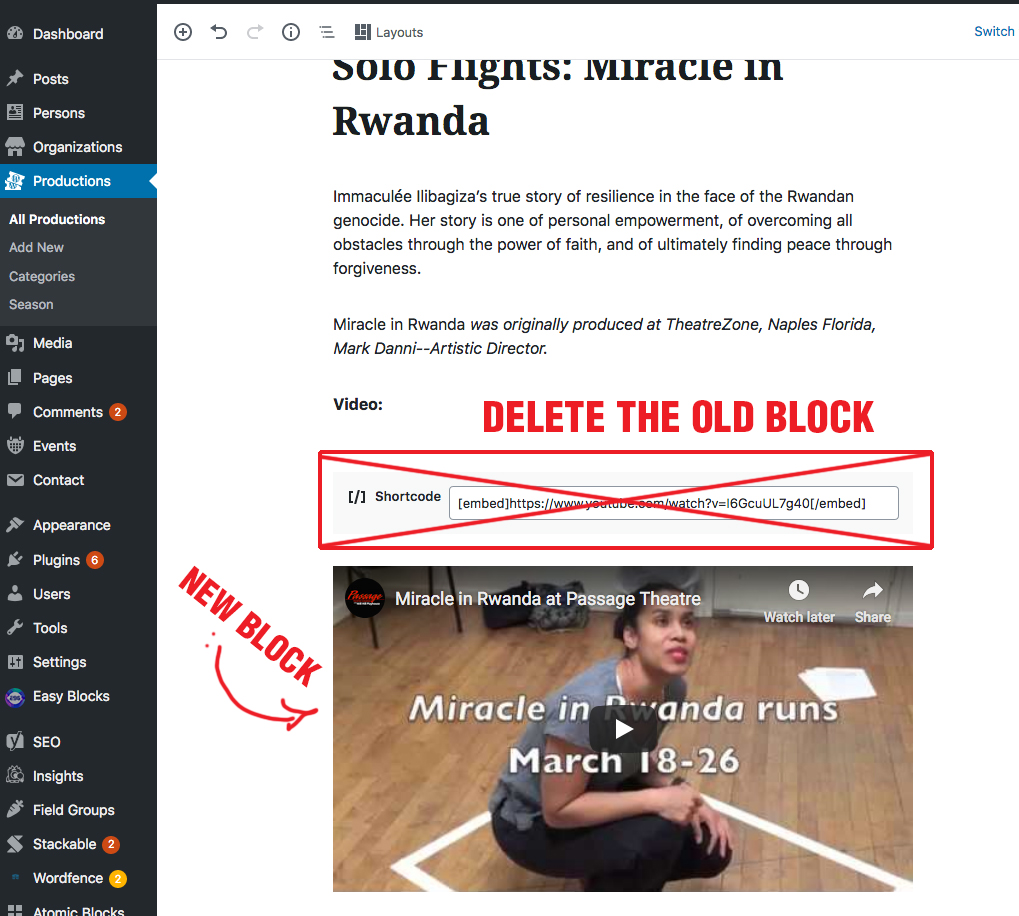
Step 2: In the Gutenberg editor, add a new YouTube block (or simply paste the URL into a blank paragraph block — WordPress will auto-detect it).
Step 3: Delete the old, broken embed block.


Step 3: Delete the old block
That’s it!
Once this is done, your video should now scale beautifully across desktop, tablet, and mobile views.
Why This Fix Matters
Mobile usability is a key factor for SEO and user experience. Broken or oversized embeds can lead to high bounce rates and lower rankings. By implementing this Gutenberg Responsive Video Embed Fix, you’re not just improving the look of your site — you’re making it more accessible, SEO-friendly, and enjoyable for all users.
Final Thoughts
If you’re facing layout issues with video embeds in Gutenberg, don’t panic. With just a few small tweaks, you can ensure your videos look great on every device.
Implement the Gutenberg Responsive Video Embed Fix today and give your content the responsive polish it deserves.


