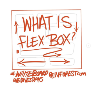
What is Flexbox?

The Flexible Box Layout Module aka “Flexbox”, makes it easier to design flexible responsive layout structure without using float or positioning. Based on the article from W3 Schools, I provide some examples of how to use Flexbox. With Flexbox, the outer layer is called a flex container with its display parameter set to “flex” in …

What’s New in Bootstrap 5

Bootstrap the wildly popular customizable responsive frame work based on twitter. Version 5 was released May 5, 2021. This version has some great updates and should be a smoother transition than from Bootstrap 3-4. Here is a quick list of some of the new changes New look and feel More explanation on customization Expands on …

How to Create a Responsive Div Table in Bootstrap 4 (The Easy Way!)

Creating responsive layouts that feel like traditional tables—but behave beautifully on all screen sizes—can be tricky. We recently tackled this challenge in a project and discovered a slick way to replicate table behavior using div table Bootstrap techniques. So, what did we do? We leaned into the power of Bootstrap 4’s flexible grid system and styled div …

Creating a Non-Standard Bootstrap Design for The Concord Advisory Group

When we were tasked with redesigning the website for The Concord Advisory Group Ltd., we chose to build on the Bootstrap framework. Bootstrap offers a robust toolkit of pre-built components, making it ideal for creating responsive, mobile-friendly websites with clean layouts, LESS variable support, and a library of helpful utility classes. However, for this project, we took …