Gutenberg Responsive Video Embed Fix

After analyzing our Search Console report, we noticed a frustrating issue — some of our embedded YouTube videos weren’t responsive on mobile devices. They extended beyond the content area, ruining the user experience and tanking our mobile usability scores. That’s when we knew it was time for a Gutenberg Responsive Video Embed Fix to solve the problem …

Creating a Responsive, Left-Side Navigation Menu with Bootstrap 4

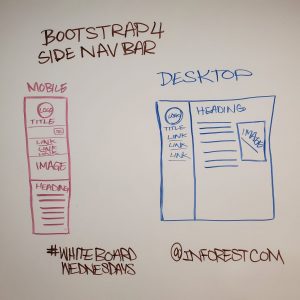
At Inforest Communications, we believe not all websites need to look the same. With just a few strategic tweaks, even the most common frameworks—like Bootstrap—can be adapted to break away from traditional layouts. Our latest project showcases this by implementing a Bootstrap left side navigation layout for desktop users, while still maintaining a top-down menu on mobile. …

Creating a Non-Standard Bootstrap Design for The Concord Advisory Group

When we were tasked with redesigning the website for The Concord Advisory Group Ltd., we chose to build on the Bootstrap framework. Bootstrap offers a robust toolkit of pre-built components, making it ideal for creating responsive, mobile-friendly websites with clean layouts, LESS variable support, and a library of helpful utility classes. However, for this project, we took …

Rethinking the Mobile Experience

Now that mobile is so necessary, companies are switching over to responsive design. That’s great, but is it enough? The first thing to consider is  “what makes a good mobile experience?” Here are my thoughts: Good site performance is essential because although speeds are getting better with 3g/4g mobile devices they are still slow as compared to …