The Drupal Media Module is a robust tool for managing media assets, and with a bit of creativity and technical know-how, you can unlock its full potential. In this blog post, we’ll explore how to create and style instances of the Drupal Media Module to enhance your website’s visual appeal and functionality. Specifically, we’ll look at creating an image style for a 50/50 layout that ensures seamless display across devices, from large viewports to mobile screens.
Whether you’re just starting with Drupal or looking to refine your approach, this guide will walk you through each step to maximize the flexibility and power of the module.
Why Custom Image Styles Matter
In this example, we used Drupal’s Layout Builder to create a 50/50 layout. However, the default “Large” image style (480px x 480px) didn’t fully utilize the space on the largest viewports. To solve this, we needed an image style that was 636px square—providing a scalable solution that adapts seamlessly to various screen sizes while maintaining a polished look.
By creating custom image styles, you can tailor media display settings to fit specific layout requirements and maintain consistency across your site. Better yet, styles like rounded corners or dynamic resizing can be universally applied using Sass or CSS, giving you flexibility and control over the design.
Step-by-Step Guide to Creating and Implementing Custom Image Styles
1. Create the Image Style
The first step is to define a new image style. In this case, we’ll create an image style called “boot 50” that resizes images to 636px x 636px and converts them to the WebP format for optimized performance.
Add another effect to convert the image format to WebP for better compression and faster load times.
Navigate to:
Configuration > Image Styles > Add Image Style
Name the new style (e.g., “boot 50”).
Add an effect to resize the image to 636px square.
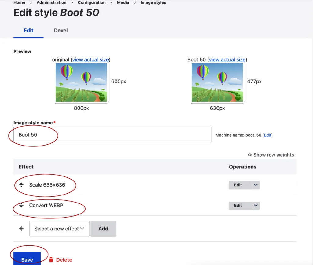
2. Add the Image Style to the View Mode
Once the image style is created, you’ll need to associate it with a view mode for media types.
- Navigate to:
Structure > Display Modes > View Modes - Edit the relevant media type view mode.
- Add the newly created image style (e.g., “boot 50”) to the image or video field.
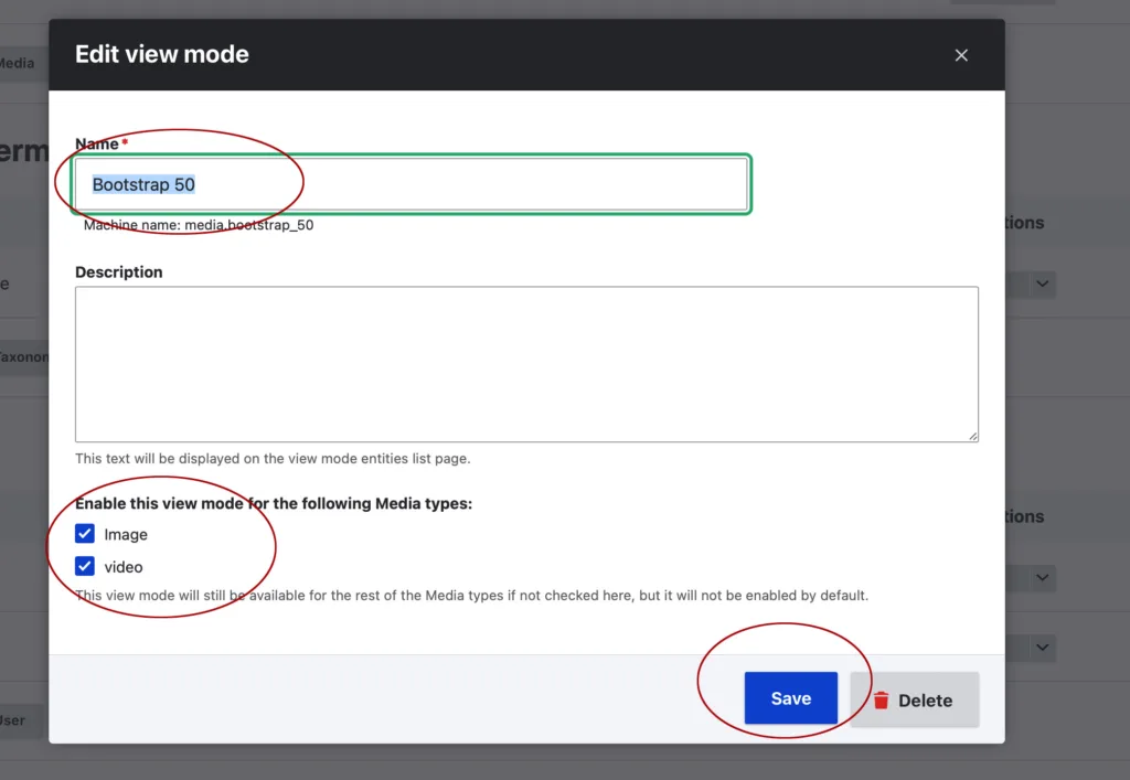
3. Update the Media Type Display
To apply the new image style to the Media Type display, follow these steps:
- Navigate to:
Structure > Media Types > Edit Image > Manage Display - Assign the “boot 50” image style to the appropriate image field.
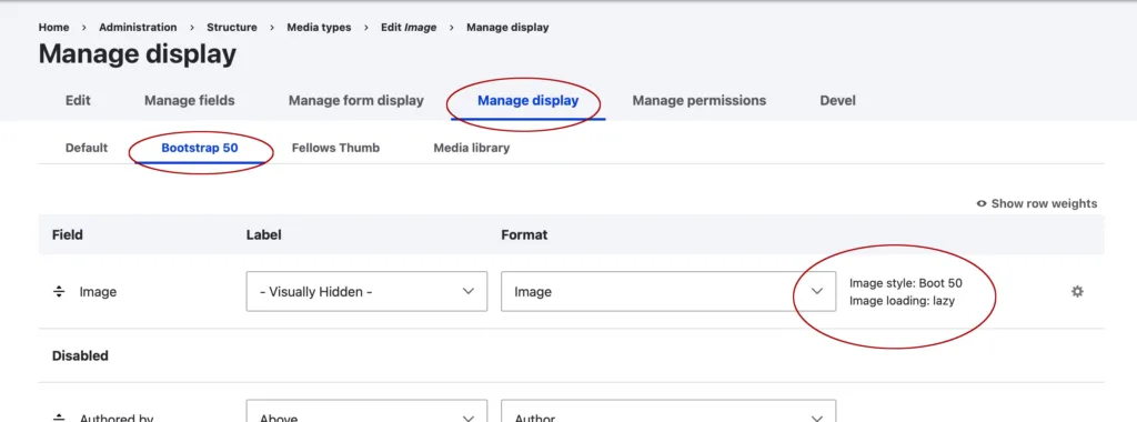
4. Add Media Type to the Text Editor
To enable easy access to the media type from the text editor, integrate it into your text format settings.
- Navigate to:
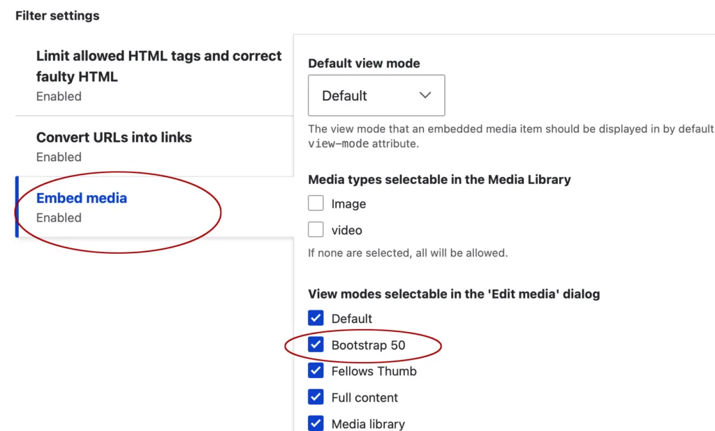
Configuration > Text Formats and Editors > Select Text Editor (CKEditor) - Enable the Media Embed button and configure it to include the desired view mode (e.g., with the “boot 50” image style).
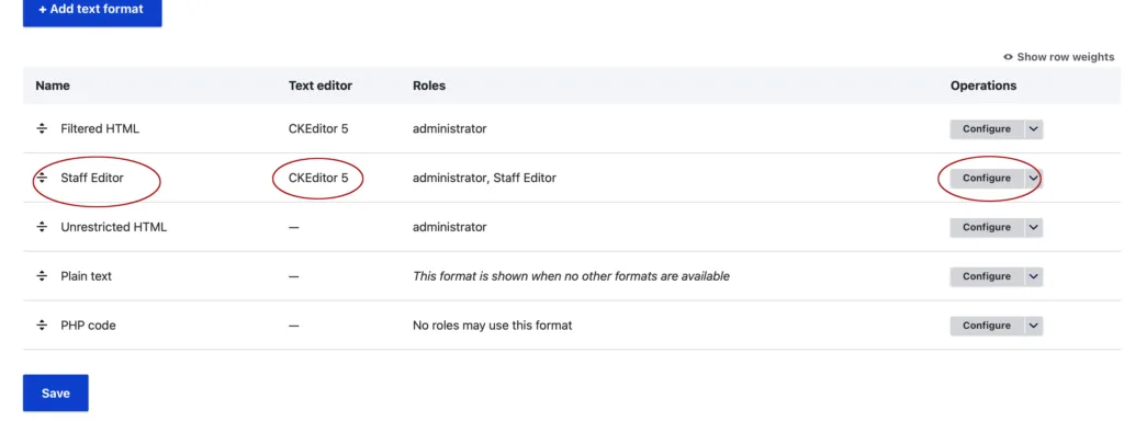
5. Apply the Media Type in the Content Editor
With everything configured, you can now use the media type in your content editor:
- Navigate to the content item you want to edit.
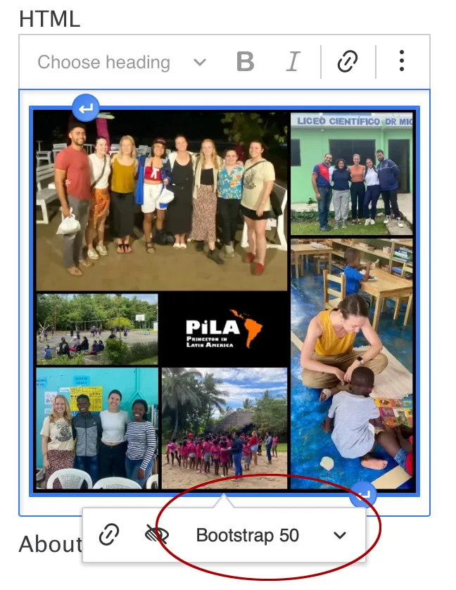
- Insert or edit an image, selecting the media type with the “boot 50” image style via the dropdown menu.
Universal Styling with Sass or CSS
For added flexibility, consider creating universal styles using Sass or CSS. For example, if you want all images using this media type to have rounded corners, simply add a CSS class to the media type and style it in your global stylesheet. This approach ensures consistency and reduces the need for manual adjustments.
Final Thoughts
The module offers powerful capabilities for crafting tailored media experiences. By creating custom image styles and integrating them into your media and content workflows, you can ensure your layouts are visually appealing, scalable, and responsive.
This method not only addresses specific layout challenges but also sets the foundation for reusable, efficient media solutions. Whether you’re building new layouts or refining existing ones, these techniques will help you unlock the full potential of Drupal’s Media Module.
Start experimenting with these steps today, and elevate your website’s media management to a whole new level!


